Brand kit
The Qapital brand
The mark, the colours and the type — plus how to use them. These mirror the design tokens the product ships with.
The mark
↓ Mark (SVG)↓ Wordmark · dark bg (SVG)↓ Wordmark · light bg (SVG)↓ Avatar (512²) (SVG)↓ Banner (1584×396) (SVG)


All vectors (crisp at any size) — the mark works on any background; two wordmark variants for dark and light; a square avatar and a social banner. Everything uses today's electric blue #207dff → cyan gradient. For PNG at a fixed size, open the SVG and export from any vector tool. Live source: components/Logo.tsx. Keep clear space, don't recolour the gradient, don't stretch it.
Avatar — profile pictures (LinkedIn, X, etc.). The mark on a deep-navy tile.
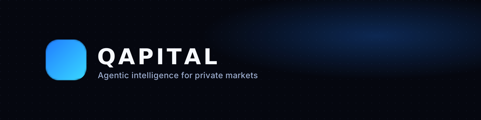
Banner — social cover (1584×396).
Colours
Signature gradient · #39d9ff → #207dff
Typography
Hanken Grotesk
Display — headings, the product voice.
Inter — body copy, the workhorse for running text and UI.
Sans — body / UI.
JetBrains Mono — 1,234 · €480M · 6.2×
Mono — numbers, code, data.